
How to Coordinate Fabrics With 10 Essential Tips
Finding the perfect combination of fabrics for your home can feel overwhelming. You want your space to look stylish and cohesive, but mixing colors, textures, and patterns often leads to frustration. You’re not alone—many people struggle with coordinating fabrics that truly complement each other and elevate their interiors.
To coordinate fabrics effectively, start by identifying fabric types and textures that suit your space and style. Choose a color palette that unifies your selections and use neutrals to balance bold hues.
Mix patterns by varying scale and style, and combine different fabric weights for depth. Remember to match fabrics to your room’s theme, prioritize care and durability, and don’t hesitate to experiment with contrasts.
With these essentials, you’ll create a cohesive, stylish look. There’s plenty more to investigate for perfect fabric harmony.
Key Takeaways
- Choose a cohesive color palette balancing warm, cool, and neutral tones to unify different fabrics seamlessly.
- Mix patterns by contrasting scale and style while maintaining consistent colors for visual harmony.
- Layer fabrics with varying textures and weights to add depth and tactile interest to your design.
- Match fabric types to the room’s style and traffic level for both aesthetic and practical suitability.
- Prioritize fabric care by selecting durable, stain-resistant, and easy-to-clean materials for longevity.
Identify Fabric Types and Textures

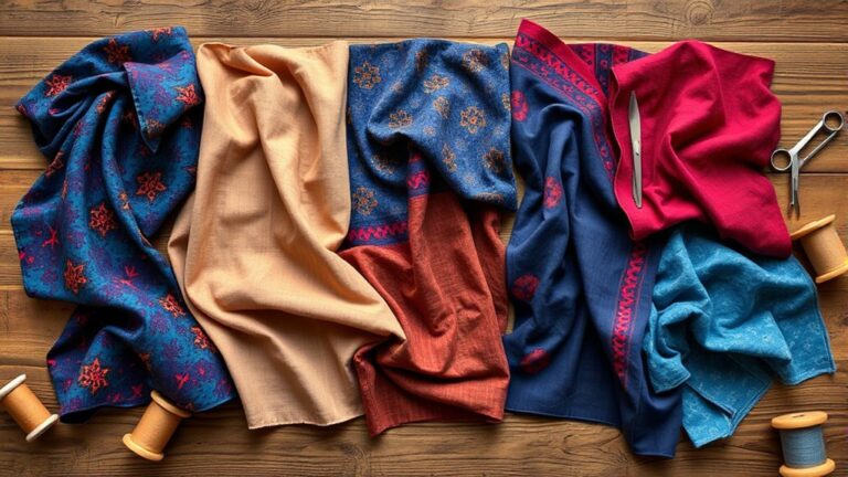
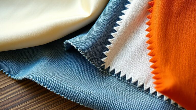
Before you mix and match fabrics, you need to identify their types and textures. Understanding textile terminology helps you recognize the qualities of each fabric, from cotton’s breathability to velvet’s plush softness. When you know the fabric type, you can predict how it will behave, whether it drapes well or holds structure. This knowledge prevents clashing combinations that feel awkward or look mismatched.
Fabric sourcing also plays a key role. Knowing where your fabrics come from can inform you about their durability and care requirements. For example, natural fibers like linen or silk often have distinct textures that contrast beautifully with synthetic blends. When you’re shopping, pay close attention to fabric labels and descriptions to grasp their fiber content and weave.
Choose a Color Palette to Unite Fabrics

You’ll want to pick a color palette that ties your fabrics together seamlessly. Try focusing on complementary colors—they really help create harmony.
Also, think about balancing warm and cool tones. It adds visual interest without making things too busy. This way, your space feels cohesive but never overwhelming.
Selecting Complementary Colors
Although choosing fabrics might seem overwhelming, selecting complementary colors creates a cohesive look that ties your entire design together. When you pick colors that naturally amplify each other, your fabrics blend seamlessly, highlighting both textile innovations and sustainable fibers. These modern materials often come in vibrant hues, making your choices even more exciting.
To help you visualize complementary colors, consider these tips:
- Pair deep navy with warm burnt orange for contrast
- Combine soft sage green with dusty pink for subtle harmony
- Match rich mustard yellow with cool slate gray for balance
- Use classic black with crisp white for timeless appeal
- Blend earthy browns with muted teal for organic vibes
Balancing Warm And Cool
When you balance warm and cool tones in your fabric choices, you create a unified color palette that brings harmony and depth to your design. Understanding textile history helps you appreciate how different cultures used warm reds or cool blues to convey meaning, influencing fabric symbolism today.
To unite fabrics effectively, select a warm color like burnt orange or mustard yellow alongside a cool tone such as teal or slate gray. This contrast energizes your space without clashing. Use neutral shades as bridges to soften gradations between warm and cool fabrics.
Mix Patterns by Balancing Scale and Style
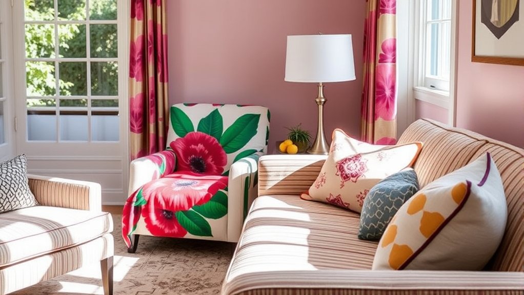
When you’re mixing patterns, a good place to start is by contrasting large and small prints. It really helps create visual interest. Plus, sticking to a consistent color palette keeps everything looking cohesive.
And hey, don’t forget to throw in different textures too. It adds depth and style, making your outfit stand out even more.
Contrast Large And Small
To create a visually appealing fabric combination, you should contrast large and small patterns by balancing their scale and style. When working with textile patterns, mixing a bold, large print with a subtle, small-scale design creates harmony and adds interest. This balance prevents your fabrics from clashing or overwhelming the space.
As you investigate fabric sourcing, look for pieces that complement each other in texture and motif, even if their sizes differ.
Consider these tips to guide your choices:
- Pair a large floral print with tiny polka dots
- Mix wide stripes with delicate geometric shapes
- Combine oversized paisley with fine pinstripes
- Offset bold animal prints with small-scale florals
- Use a large check pattern alongside miniature plaids
This approach ensures your coordinated fabrics feel cohesive and dynamic.
Match Color Palettes
Although mixing different patterns can be tricky, matching their color palettes helps you create a unified look that feels intentional. When you choose fabrics sharing similar hues, you balance scale and style effortlessly, allowing patterns to complement rather than clash.
This harmony not only improves textile symbolism where colors convey mood and meaning but also simplifies fabric maintenance since consistent colors often wear evenly and fade less noticeably. Stick to two or three main colors across your fabrics to keep coordination tight.
Combine Different Textures
While coordinating fabrics, combining different textures adds depth and interest that color alone can’t achieve. When mixing patterns, balance scale and style to create harmony.
Consider how smooth silks contrast with rough linens or how velvet’s plushness complements crisp cotton. Embracing fabric sustainability means choosing textures made from eco-friendly materials, which often carry unique, authentic qualities influenced by historical textile trends.
These trends reveal how past cultures paired textures, inspiring your modern mix.
Try these combinations for a dynamic look:
- Soft boucle with sleek leather
- Lightweight chiffon paired with chunky wool
- Linen mixed with nubby hemp
- Smooth satin alongside textured jacquard
- Ribbed cotton combined with distressed denim
Combine Different Fabric Weights for Depth
When you mix fabrics of varying weights, you create a layered effect that adds visual interest and dimension to your space. Combining heavier fabrics like velvet or denim with lighter ones such as linen or chiffon brings depth without overwhelming your design.
Keep fabric durability in mind. Heavier materials often withstand wear better, making them ideal for high-traffic areas or frequently used furniture. Meanwhile, lighter fabrics can introduce softness and airiness.
Consider seasonal fabric choices to improve comfort and style throughout the year. For colder months, pair thick, insulating textiles with lighter ones to maintain coziness and balance. In warmer seasons, lean on breathable, lightweight fabrics layered with sturdier options for structure without heat retention.
Use Neutrals to Anchor Bold Fabric Choices
You’ll find that neutral colors provide a calm foundation. They let bold patterns shine without overwhelming your space. When you pair neutrals with vibrant fabrics, it helps balance the brightness and keeps your design grounded. Using this approach, you create a look that feels lively and harmonious all at once.
Benefits of Neutral Colors
Why do neutral colors play such a crucial role in fabric coordination? Throughout textile history, neutrals have been a foundation in fabric manufacturing, offering timeless versatility. When you use neutral shades, you create a balanced backdrop that highlights bolder fabrics without overwhelming your space.
Here’s why neutrals benefit your fabric choices:
- Anchor bold colors for a cohesive look
- Provide a calming effect amidst vibrant patterns
- Offer flexibility for seasonal updates
- Improve texture visibility without color competition
- Guarantee longevity in style despite trends
Pairing Neutrals With Patterns
Neutral colors don’t just stand on their own; they work wonders alongside patterned fabrics. When you pair neutrals with bold patterns, you create a balanced look that lets the design shine without overwhelming your space.
Understanding textile history shows us how classic neutral tones have always anchored vibrant prints, offering timeless appeal. You can use this knowledge to mix modern patterns with neutral fabrics seamlessly.
Plus, choosing sustainable fabrics in neutral shades supports eco-friendly practices, reducing waste from fast fashion trends. By grounding bold, patterned textiles with neutral hues, you maintain harmony and longevity in your decor.
Balancing Bright and Calm
When working with bold, bright fabrics, it helps to balance their intensity by anchoring them with calming neutral tones. This approach creates harmony in your designs, letting vibrant colors pop without overwhelming the space.
In textile manufacturing, fabric dyeing techniques often produce vivid hues that demand this kind of balance. You’ll find that pairing these bright fabrics with neutrals can ground the overall look and make your choices feel intentional.
Try incorporating:
- Soft beige cushions alongside a fiery red sofa
- Light gray curtains framing a bold floral print
- Cream-colored rugs under vibrant patterned throws
- Muted taupe upholstery with electric blue pillows
- Whitewashed wood accents to calm rich fabric tones
Using neutrals as anchors ensures your bright fabric choices shine with style and sophistication.
Layer Fabrics to Create Visual Interest
Although layering fabrics might seem challenging at first, it’s a powerful way to add depth and texture to any space. Start by combining fabrics with different textures and weights. Think lightweight sheers over chunky weaves. This contrast highlights the unique qualities of each material, making your space more dynamic.
Pay attention to fabric dyeing techniques, as the variations in color saturation can create subtle yet striking layers. Mixing textiles with different weaving patterns also enhances visual interest. For example, pair a tightly woven fabric with a loose, open weave to add dimension.
When you layer thoughtfully, you invite the eye to investigate, preventing the room from feeling flat or monotonous. Don’t be afraid to experiment with unexpected combinations. Just keep the color palette cohesive to maintain harmony.
Match Fabrics to Your Room’s Style
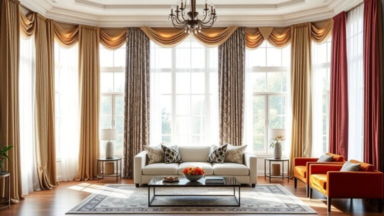
Since every room has its own unique vibe, matching fabrics to your style guarantees a cohesive and inviting look. Start by identifying your room’s theme, whether it’s modern, rustic, or classic, and choose fabrics that elevate that mood.
Consider fabric maintenance. Durable, easy-to-clean materials suit busy spaces, while delicate textiles fit quieter rooms. Eco friendly textiles not only support sustainability but also blend beautifully with natural or minimalist decor.
Use texture and pattern to reinforce your style without overwhelming the space.
Here’s how to match fabrics effectively:
- For modern rooms, pick sleek, smooth fabrics like leather or microfiber
- Rustic spaces shine with linen, burlap, or cotton blends
- Classic decor pairs well with velvet or brocade for richness
- Minimalist rooms benefit from neutral, eco friendly textiles with subtle texture
- High-traffic areas demand fabrics that are easy to clean and maintain
Experiment With Contrasting Fabrics for Impact
To create a striking visual effect, you can pair contrasting fabrics that bring energy and depth to your space. Start by choosing fabrics with different textures, like pairing smooth silk with rough linen to add tactile interest.
Don’t shy away from bold color contrasts. A bright fabric against a neutral one instantly grabs attention.
While experimenting, keep pattern matching in mind. You don’t always need exact matches. Instead, focus on complementary patterns that balance each other without overwhelming your room.
For example, pair a large floral print with a small geometric pattern in similar hues. This creates harmony despite the contrast.
Keep Fabric Care and Durability in Mind
When choosing fabrics, you should consider how easy they are to care for and how well they’ll hold up over time. Fabric washing requirements and stain removal capabilities directly affect your daily use and maintenance.
Consider ease of care and durability when selecting fabrics for everyday use and maintenance.
If you pick delicate materials that demand special care, you might find yourself spending extra time and effort. On the other hand, durable fabrics with simple washing instructions save you hassle and keep your items looking fresh longer.
Keep these points in mind:
- Check if the fabric can handle regular machine washing.
- Look for materials resistant to common stains.
- Consider how fabric texture holds up after multiple washes.
- Choose fabrics that dry quickly to avoid mildew.
- Test small stain removal methods before full cleaning.
Trust Your Instincts and Adjust Fabric Choices
Although guidelines and tips provide a solid foundation, you should trust your instincts when choosing and combining fabrics. Fabric coordination isn’t just about rules; it’s about what feels right for your style and space.
If a fabric’s texture or color speaks to you, don’t hesitate to include it even if it bends typical coordination advice. Remember to balance your gut feeling with practical concerns like fabric durability, especially for high-traffic areas. You want fabrics that not only look great but also stand the test of time.
Material sustainability is another factor to weigh. Trust your preference for eco-friendly options when possible. If a sustainable fabric aligns with your vision, it’s worth adjusting other choices to make room for it.
Ultimately, your instincts guide you to a harmonious, functional, and personalized fabric mix. So, stay flexible, experiment, and don’t be afraid to tweak your selections until everything feels just right.
Frequently Asked Questions
Where Can I Buy Sustainable Fabrics for Home Decor?
You can buy sustainable fabrics for home decor from online stores specializing in eco friendly sourcing, like Organic Cotton Plus or Etsy shops focusing on sustainable textile brands. Check out retailers such as Boll & Branch or Fabric Society, which prioritize ethical production.
Local fabric boutiques might also offer eco-friendly options. Always look for certifications like GOTS to guarantee the fabric meets sustainability standards, helping you make a responsible, stylish choice.
How Do I Remove Stains From Delicate Fabrics?
Imagine using a quill to carefully dab at a stain. That’s how gentle you need to be with delicate fabric care. For effective stain removal techniques, start by blotting the stain with cold water and a mild detergent.
Avoid rubbing; instead, gently press the fabric. If needed, use a soft toothbrush for stubborn spots. Always test any cleaner on a hidden area first to prevent damage, and air dry your fabric to keep it pristine.
What Are the Best Fabric Choices for Allergy Sufferers?
You’ll want to choose allergy friendly materials like organic cotton, bamboo, and linen since they’re naturally hypoallergenic fabrics. These options resist dust mites and irritants, helping you avoid allergic reactions.
Avoid synthetic fibers that trap allergens. Also, consider tightly woven fabrics that prevent pollen and pet dander from settling in. By selecting these hypoallergenic fabrics, you can create a comfortable, allergy-free environment for yourself or loved ones.
Can Fabric Coordination Improve Room Acoustics?
Yes, fabric coordination can elevate room acoustics. When you choose the right materials, like soundproofing curtains, you reduce echo and absorb unwanted noise.
Adding acoustic panels covered with thick fabrics further improves sound control. By combining these elements thoughtfully, you create a quieter, more comfortable space.
How Often Should I Update Fabric Choices in My Home?
You should update your fabric choices every 5 to 7 years, like switching from a rotary phone to a smartphone. Fabric durability plays a big role. High-quality fabrics last longer, so you won’t need to replace them as often.
Keep an eye on color coordination too. Fading or outdated colors can make a room feel tired. Refresh your fabrics when they no longer match your style or when wear and tear becomes obvious.
Conclusion
Now that you’ve got these essential tips, imagine your space coming alive with perfectly coordinated fabrics. Each texture, color, and pattern playing its part.
You might hesitate at first, wondering if mixing that bold print with a soft neutral will work. But trust your instincts, take that leap, and watch as your room transforms into a stunning, cohesive haven.
The secret to fabric harmony is closer than you think. Are you ready to uncover it and master how to coordinate fabrics?